Why not just use that drawing that your niece, nephew, or next door neighbor made? It’s got charm, and they even made it into a jpeg for you. Right? But there are more than few reasons why it might not be the best idea to paste it on your letterhead as is.
“LOCKHEED MARTIN is gonna love this!”
At Colonial Marketing, we like to use the Four Laws of Logo Design when educating a client:
- The logo must be describable
- The logo must be memorable and recognizable
- The logo must be effective without color,
as much as it is with - The logo must be scalable
These rules, though simple and somewhat self-explanatory, are often overlooked by someone who hasn’t made a logo before. And like most intricacies of life, there are additional practices to consider when contemplating these four. (Not including correct file types, and common layout variations, which we’ll save for another blog post.)
The logo must be describable
This first rule is deceptively simple, it seems cut and dry, but there are more than a few factors that go into the execution of “describable”, as well as having a fair amount of overlap with the other three rules.
So, what do we mean when we say describable? Although logo designs are becoming more complicated as they compete to stand out in this age of the Adobe Creative suite, the simplest and most easily describable logos, are still king of the hill for established businesses. They also tend to readily fit into the parameters of other 3 rules.
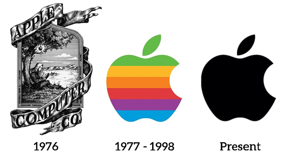
Take for instance the transformation undergone by Apple computers over the years. The first incarnation was a design as beautiful as it was complex, and was subsequently scrapped shortly after its creation for the iconic apple shape missing a bite, to better coincide with the slogan at the time “Byte into an Apple”.
Some expand the four rules to include a fifth, “A logo must be descriptive of the business”, but this rule isn’t always followed (as seen in the McDonalds golden arches, or Apple’s apple). It’s a facet of the design process to consider, but not always necessary to follow. Often, what you’ll see across different industries is, that the smaller the business, the more descriptive the logo is of that business’ trade.
The logo must be memorable and recognizable
A logo with a myriad of creative elements swirling around it, might look nice in a frame hanging in the living room, but if you want someone to remember your business logo (and what it stands for), Keep It Simple Stupid, and save the fluff for the peanut butter sandwiches. But for every rule, there are always exceptions. Just make sure you’ve got the right arguments to back up your creative “delinquency”.
In addition to being more easily remembered, a simpler logo also makes our third and fourth rules much easier to follow… effective without color, and scalable.
The logo must be effective without color,
as much as it is with
There’s a reason that there aren’t many modern black and white movies, color offers so many more options for expression. You’re also restricted in the types of artistic shots when setting up something to look great in black and white, but such is the struggle in logo design. It’s true that most of the time you’ll be able to display your logo in full glory of a 16 million color spectrum.

JPEGs are capable of displaying up to 16 million colors, which is great if you’re this guy, but it isn’t always the best route for a professional logo.
But, business logos aren’t relegated to computer monitors or a work vehicle wrap. Quite often they are found on black and white stationary, or will appear on a on a background that seriously clashes with your logo. In that case, some designers will make aspects of the logo a single flat color to match whatever project they’re inserting the logo into. Which brings us to our last but possibly one of the most important rules of logo design… scalability.
The logo must be scalable
From billboards to letterhead, your logo must appear legible at any size! Logos with already small text accompanying them will be lost when shrunk down to a square inch, and busy logos will become a jumble of unrecognizable pixels.
And logo sizes are becoming even smaller, favicons appear as a small icon in your browser’s web page tabs; and at a mere 16 x 16 pixels, your logo STILL needs to appear legible and recognizable. Even the Michelin man (Bibendum), one of the world’s oldest trademarks, has managed to squeeze into the claustrophobic branding space of the favicon.
![]()
There is a recent and acceptable trend, of adjusting elements of the design as the design scales down (especially for website header icons), it’s known as being responsive, but the added complication of additional logos (not to mention the plethora of file types), may be an extra step in the branding process than some businesses would prefer not to undertake. But as time goes on, responsive logos, just like responsive website designs, are becoming the norm.
![]()
As you can see, there’s quite a bit of forethought that designers must wrestle with when creating the perfect logo. Having a company such as Colonial to help steer the creative process is crucial. We know what works, and we know what aspects to steer away from, most importantly of all we’re only a phone call away.

So, before recruiting a stranger off the internet who might ignore the four laws, copy another already established logo, or simply waste your time and money, give Colonial a call and let our designers make your logo the apple of your eye.